Logo Case Study: Brain Smashing Ads
These fine folks approached us with a relatively clear vision of what they wanted their logo design to be. They even filled out my Logo Questionnaire in great detail. I love it when that happens. 🙂
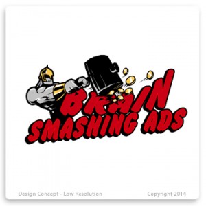
They had some very specific requests, such as the visualization of an actual brain being punched by a fist. Yes, you read that correctly, and that’s why I love this job. Never a dull moment, and plenty of new challenges. They also wanted a comic book feel. They also requested that the logo have an overall bold, masculine feel.
Not a problem.
Even with their well-documented description of what they wanted, there was still enough leeway for us to have a bit of fun with the first round of designs.
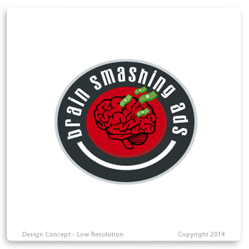
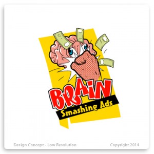
Hence, the sampling of the first set (including one where we dared to deviate from the brain concept):
Just a fun little fact, naming the designs after past Presidents was extremely helpful in helping us differentiate between designs as we gathered the client feedback. It was much easier to make sense of an email from the client that said, “We like the Roosevelt design, but not so much Carter,” as opposed to, “We like the design with the money flying out of the brain, but not so much the one with, you know, that yellowish-gold brain thingamajiggy.” Oh the joy of logistics.
In addition, they requested the introduction of newsprint pixelation on the hand, and emphasis on the “POW!”-like graphic seen in so many old-time comic books.
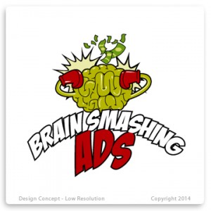
After we got their feedback, we took things to round 2:
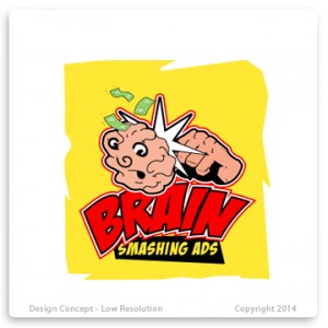
By this time, they were getting giddy, and so were we, naturally. Call it the thrill of the chase as we got closer and closer to nailing down the final design. They requested we remove any eyes from the brain because they found it a bit scary, so we were happy to oblige. They also preferred a more natural color to the brain, and requested that we remove the green and red brain colors. They really wanted a Lichtenstein feel to it, reminiscent of comic books from the 1930’s.
All that was really necessary was a bit of mixing and matching amongst the logo concepts from that round.
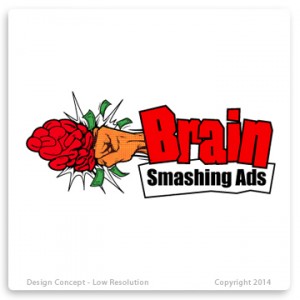
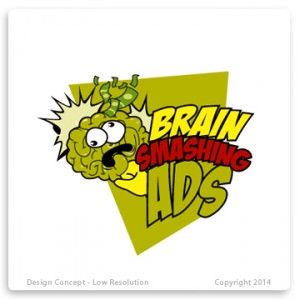
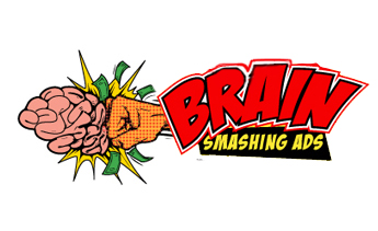
We approached the next round eagerly, with these two being the closest:
By this stage in the game, all they had to do was point and choose which one they wanted.
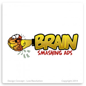
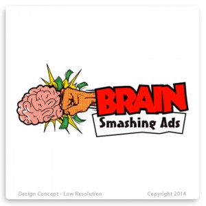
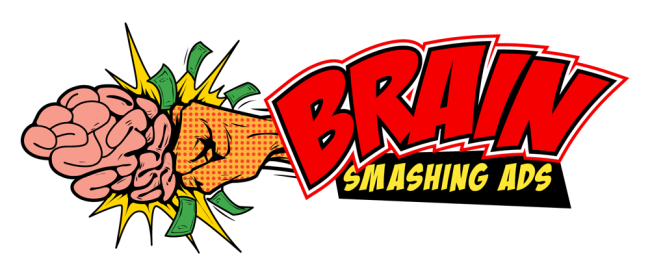
This was the winner:
Closing Thoughts
As with any collaborative project, communication was key as we progressed step by step with the client. It’s always extremely fulfilling to help a business nail down a rock-solid visual interpretation of their identity.
However, it’s worth bearing in mind that having a snazzy logo is not the “end all, be all” of creating your business identity. There are many other components that come into play when defining the brand of your business, with your logo only being one of the initial steps. It can potentially take years to build your brand as you nail down your mission, define your culture, conduct research, and develop your product.
Yet still, with all that said, having a striking, professional logo that embodies the personality of your business is a great first step.